Part 2 of a series on photographic preservation from our Collection Team, for Part 1 see Cased Photographs.
In Part 2 we look at 19th Century photographic prints, that is images created from a camera negative.
Among photographic prints there are two broad categories:
- Printing out papers, a physical development using the sun’s energy to convert the silver salts to the metallic silver image. This was then fixed with hypo to remove the unexposed silver salts, washed and then dried. Typical printing out papers are, albumen, collodion and gelatin printing out papers. These were contact prints where the negative and paper were held in contact and therefore the print size was determined by the size of the negative.
- Developing out papers, the exposed silver is chemically reduced to form the metallic silver image using a chemical process. Once the image is developed the same fixing, washing and drying process was followed.
The drawback with Daguerreotypes, Ambrotypes and Tintypes is that these were each unique objects, while that may have been part of their charm in much the same way as a painted portrait was unique, the ability to share photographs became important. Only months prior to Daguerre announcing his process, the Englishman William Henry Fox Talbot presented his photogenic drawing process. Where the two processes differed was Talbot’s method created a negative that could be printed onto another piece of paper to create multiple copies of the original. While Talbot’s photogenic drawing process was poorly refined in 1841 Talbot announced the Calotype process that used sensitised salted paper to produce the print. While it still didn’t match the beauty of the other processes the Calotype defined the way photographic technology would evolve until the popularisation of digital cameras.
At first Calotypes were no match for the sheer exquisite beauty of Daguerreotypes, Ambrotypes or even well- made Tintypes, but this changed with the use of albumen (egg white) as part of the sensitised layer for glass negatives in the very late 1840’s. With an albumen-on-glass negative the detail of the captured image could match the other processes. By 1851 a superior method of producing negatives had arrived with the wet plate process. This used collodion, the same material as Ambrotypes, to create the sensitised layer. The prints were then produced on papers that used albumen that had been sensitised with silver salts.
Albumen prints
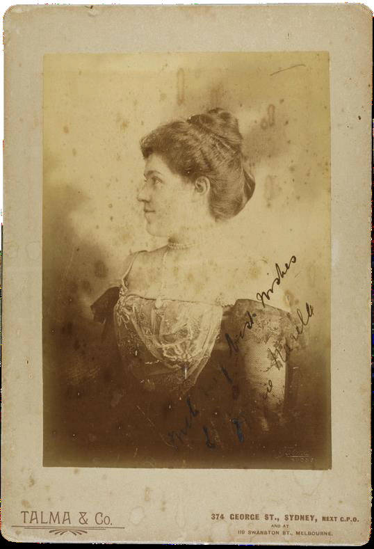
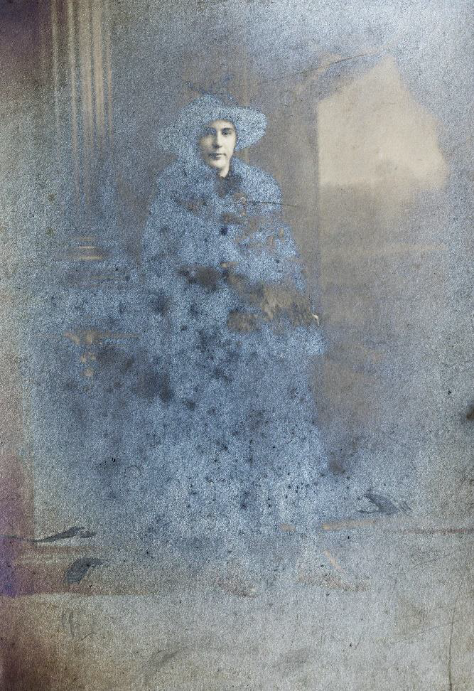
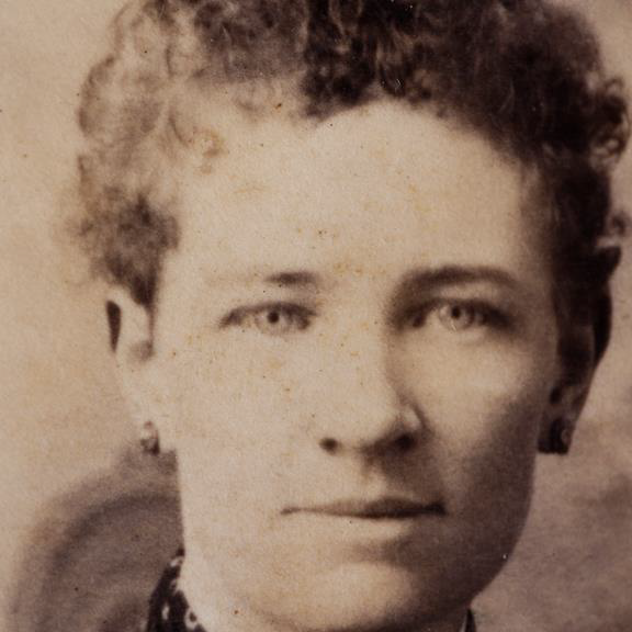
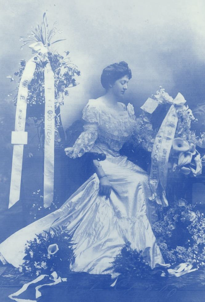
Albumen prints are commonly seen as the small carte- de-visité, calling cards that became exceedingly popular in the 1860’s. Typically a carte-de-visité was 64x100mm, the thin albumen paper was adhered to a card for stiffness. Later carte-de-visités commonly had gilt edges as ornamentation.
Larger prints, around 115x165mm, called cabinet cards, began to appear in the mid 1860’s. Again, ornamentation was added.
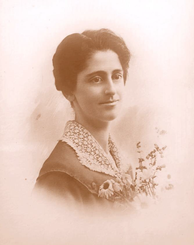
Albumen prints originally have a reddish-brown image colour, however this was most often gold toned to create a richer purplish coloured image.
From the late 1860’s/early 1870’s tinted papers became more common. Often the paper was tinted pink.
Another potential clue to dating an albumen print is the level of gloss. High gloss burnished prints were common from the mid 1870’s, although years of wear may have diminished the gloss somewhat.
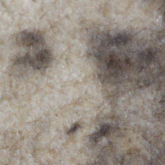
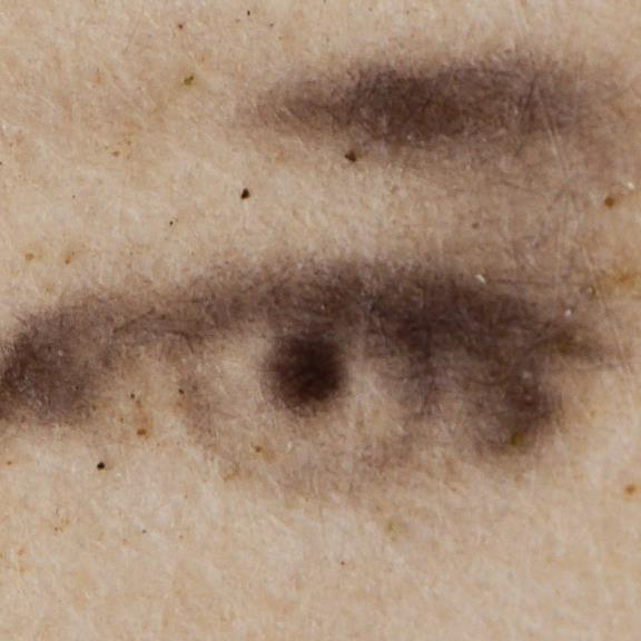
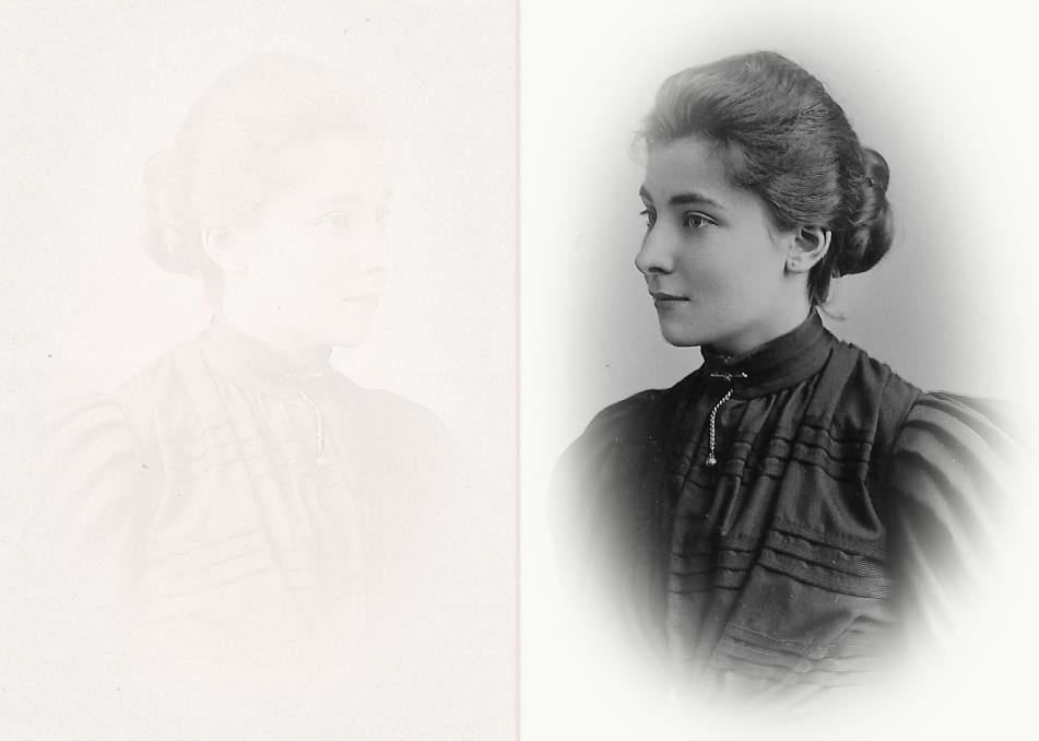
Most albumen prints will have a degree of image fade due to silver oxidation. This may be overall lightness, especially noticeable in the highlight regions where detail may be washed out. Other indicators are small yellowish spots or a mottled appearance. One cause of bleached spots or mottling of the image is due to dust from the gilding material, that contained zinc, reacting with the silver in the image over time.
Another clue to identify an albumen print is by close examination where it is possible to see the paper fibres through the albumen binder.
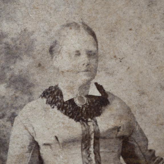
Paper fibres are also visible around the print edges (the actual print not the mounting card) where they may be some damage and the two layers, the albumen and paper base can be seen.
Collodion printing out paper
The use of collodion (cellulose nitrate) in photography dates back to the early 1850’s, however it wasn’t until the later part of the 1880’s that silver bromide printing out papers became widely popular.
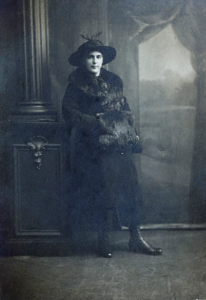
One notable difference between albumen and collodion printing out papers is the incorporation of a layer of baryta (barium sulphate). The baryta layer made for a smooth coating over the paper and was highly reflective giving the highlights a brighter appearance. Collodion could also be burnished to give a very high gloss finish. Changing public tastes saw the introduction of matt collodion printing out paper in the mid1890’s. This became the paper of choice for portraits until the 1910’s.
To identify a collodion print there are a few clues. The paper base fibres are hidden by the baryta layer. Looking closely at the edges of a print with a magnifying glass you will see three distinct layers.
Collodion prints may also exhibit a slight iridescence when viewed at certain angles, this is a different appearance to the silvering out iridescence commonly seen on old photographs. The iridescence appears more evenly across the surface rather than in daker or shadow areas of the print. It may also be noticed that the surface is very susceptible to damage, more so than gelatin prints.
Gelatin printing out papers
Despite the technology to chemically develop an image using gelatin emulsions being available since the 1870’s, the first gelatin binder prints used the traditional printing out process. In the overall structure gelatin printing out papers look identical to glossy collodion, with a paper base, baryta layer and binder. These new papers became popular from the late 1880’s and had a high gloss finish. Commonly these were gold toned to give a similar mage colour to similar to albumen papers. With the trend to matt collodion the popularity of gelatin printing out papers diminished as the matt appearance could not be matched, even though attempts to produce a matt surface with ‘matting agents’, such as rice flour, being used. The matt finish of collodion remained the popular choice.
However, gelatin printing out papers or POP were still being used to provide fast low-cost proofs for black and white images for clients well up into the 1970’s. These were generally unfixed and had a limited life as any exposure to light would continue to reduce the remaining silver salts and darken the image until there was little left visible.
Gelatin developing out prints
The advantages of being able to develop an image and not have to rely on a sunny day are considerable and by the mid 1900’s gelatin developing out papers were by far the most common type of photographic image. With improvements in silver gelatin technology the emulsions became more sensitive to light and by the mid 1890’s ‘gaslight’ papers became available. Not only were these papers able to be exposed using an artificial light, at that time a gas flame, but also came the opportunity to make enlargements.
Gelatin developing out papers also had the three-layer structure of printing out papers. However, there are simple two-layer ‘Real Photo Postcards’ that use the paper base with the emulsion applied directly with no baryta layer. Although there were many photographers that made these, Real Photo Postcards were popularised as a service by Kodak in 1907.

Identifying printed out versus developed out prints
At first glance this is quite difficult as both processes produce high quality continuous tone images. Largely the identification is by the image itself and using clues such as landmarks, fashions and equipment to give an approximate date. The technical difference is in the image structure which requires high magnification.
Printing out papers have a very fine image structure as the silver is formed by the exposed silver being reduced by light. Developed out prints have an image structure that has a tendency to appear ‘grainy’, although the actual silver grains are too small to see, however the appearance may be seen using a 10x magnifier.
Printing out papers also tend to a warm or purplish overall hue, which is a function of the size of the metallic silver particles that make up the image. Although developed out papers may be toned and this difference in hue is not always reliable.
Developed out papers have a propensity to silver oxidation. This is noticeable as fading, as albumen prints tend to do, or a metallic sheen referred to as ‘silvering out’ or ‘silver mirroring’, most noticeable around the edges or in mid to dark tone areas which have the greatest concentration of silver.
It may be possible to obtain a better copy from a silvered print with careful control of the lighting to reduce reflection from the metallic silver surface
Adding colour
Hand colouring
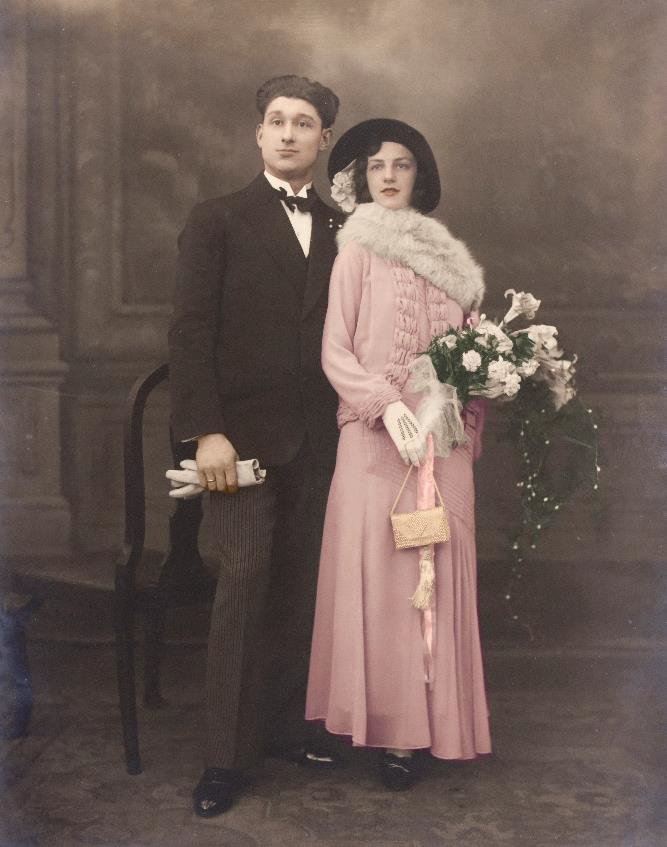
The addition of colour to a monochrome print began with the earliest photographs. Cased images, Daguerreotype, Ambrotypes and Tintypes, may all be retouched with splashes of colour. With the advent of albumen and printing out papers this practice continued. This may be as little as a slight touch of ink to blush a cheek or a wash of blue or green to differentiate sky or grass, or it may transform the photograph into a full colour rendition.
Over-painting photographic portraits to produce a ‘painting’ was a common practice. Through the decades the media used to add colour varied with no one type really achieving dominance. Water and oil-based paints and dyes were used for hand retouching by amateurs and professionals. The final result could be spectacular, creating a work of art in its own right.
Tinting and toning
The silver that forms the photographic image may be modified to produce silver salts with a variety of colours. The most well know is sepia, a reddish-brown colour. However, toning processes can change the overall hue of the image to almost any colour imaginable, from bright reds, to greens, the blue. Some prints may have been ‘split toned’ where two different toning solutions have been applied. Split toning was not a common procedure.
The identifying criterion for a toned print is that the darker areas are coloured and the highlights are not.
As opposed to toning, tinting a print involves an overall wash of colour so that the darker areas remain substantially neutral and the highlight areas have colour. Any imaginable colour could be applied.
Other processes
Platinotype
As well as silver other metals were occasionally used to form a photographic print, one was platinum. While uncommon in Australia these are occasionally found in old albums or in presentation folders. The most common date range is between the early 1880’s to the 1930’s although some later examples may be found.
Platinotypes are quite difficult to differentiate from high quality silver printed out prints. Platinotypes have a wide range of very delicate tones and are usually neutral black to faint bluish in tone. The surface characteristic is matt and as there is no baryta or other layers the paper fibres are readily visible, but with high quality paper these may be harder
to discern.
The most identifiable characteristic of platinotypes is the ‘image transfer’ where a faint mirror positive image may be seen on adjacent paper. This is caused by the catalysing nature of platinum metal causing a discolouration reaction the adjacent paper.
Cyanotype/’Blueprint’
There were many ways to produce a photographic image using non-silver technologies, the most popular being cyanotypes. Cyanotypes were based on the blueprint process developed in the 1840’s. Cyanotypes have a blue image tone and may tend to pale yellowish tint in the highlight regions. The heyday of cyanotypes was between the 1890’s to 1910’s, although as an amateur process it is still used today. Apart from the readily identifiable saturated blue image tone blue image hue cyanotypes have no emulsion or baryta layer, although the paper surface may be calendared to a very smooth finish.
Collotype
Another common process for photolike prints was the Collotype. This was a photomechanical process that used a gelatin coated paper to produce a low-cost printing plate by deliberately distressing the gelatin and causing it to forms cracks, known as reticulation, in relation to the tone of the finished print. Areas to be printed darker have a higher number of cracks to hold the ink.

Collotypes are easily identified by the very distinct fine crescent shaped grain pattern. The process dates from the 1870’s and is still in use for specialised high- quality printing. Collotypes were frequently used in the 19th century to print postcards.
Letterpress
The letterpress halftone process was introduced in the 1880’s and is still in use. Again, it is the structure of the image that gives a strong clue to the process. Letterpress images have a formal dot pattern.
In the 19th and early years of the 20th century the screen size, that determines the resolution, was quite coarse and the resultant images were far from photographic quality. As technology improved the dot pattern became progressively finer and finer and the images began to have a more ‘photographic’ impression.
The dot pattern is created by exposing the plate through a screen to break the image up into a regular series of ‘dots’ of varying sizes depending on the amount of light. The plate was then etched and ink applied and transferred to the receiver paper.

Prints on glass
Photographic images were also produced on substrates other than paper.
Opalotypes
Glass was commonly used to produce large portraits that were usually hand coloured. The process was similar to developed out papers, a light sensitive silver emulsion was coated onto an opaque white glass plate, occasionally the plate was curved. The emulsion was exposed and developed in the usual way. The resultant print was mounted in an elaborate frame, smaller prints may be cased similarly to Daguerreotypes and Ambrotypes. Prints on white glass are occasionally referred to as ”Milk Glass Photographs”.
Lantern slides/Hyalotypes
In 1850 the Langenheim brothers developed a way of creating a positive image on a small glass plate that could then be projected, through an improved version of the ‘Magic Lantern’ popular in the era. These were the precursor to the familiar 35mm slides of the 1950’s -~2000’s.
Lantern slides are two pieces of glass ~75mm square. One piece of glass has the emulsion and image. The glass is held together by gummed paper or cloth tape. Often an aperture card is also added.
The images may be hand coloured. The technology was used until the 1970’s for cinema advertisements.
Lantern slides are quite robust although the glass plates may be broken.

Leave a Reply